

Florida Blue
Employer: frog design | Client: Florida Blue
May 2019 - August 2019
Role: Design Technologist
Tools: React JS + StorybookJS + Redux + Green Socks Animation Platform + Algolia
Florida Blue, a large health insurance provider with 16MM+ users, came to frog design in search of a new digital design language. A major component of this overhaul involved creating a series of microsites, as well as redefining the find/get care web apps, developing a registration flow, and creating an interactive, captivating onboarding experience. I had a chance to work on, and successfully deploy, all of these sub-projects in my 4 months at frog. The onboarding experience, dubbed “Second Space,” is now publicly available, and is hosted live at the link below.
Stakeholders
Florida blue
Goal: Contextualize the plan-discovery process to drive sales and increase user conversion. Increase pricing and plan information availability to improve customer perception of Florida Blue'.
patients and Potential patients
Goal: Enhance understanding of various insurance plans in order to maximize shared understanding. Remove the burden of unexpected - be totally transparent.
medical professionals
Goal: Increase visibility so patients and potential patients can more easily book appointments. Increase procedure pricing transparency for both in-network and out-of-network patients.
Process - Ideation

Brainstorming and Scheduling
Given the large scope of work, the design technologists and designers would have to stick to a fast paced schedule while splitting up work into as many pieces as possible, avoiding duplicate work and minimizing iterations. Our sprints were fast paced, with weekly deliverables sent to the client. We used the Efficiency, Visualization, and Automation (E.V.A.) system to prioritize work, visualize deliverables which could be handed off to developers, and break the processes into reusable components which would enhance automation in the long run. The process proved to be effective in breaking down the large scope of deliverables into actionable pieces with concrete deliverables and delivery dates.

User Research
The team user tested the first iteration of the site (seen below) on a number of users via video conferencing. Interestingly, one of the users in the study took the video call from her mobile phone, which was entirely unexpected and launched our user test from a desktop-only evaluation to a full scale responsive analysis. The insights gained from this test in particular helped us re-focus the work and ideate more flows and interactions for varying viewports.
Iterations

Version 1: We can do better!
The initial design documents we had been provided looked good, but hadn’t been user tested before design —> development handoff. The design language system also hadn’t been fleshed out. Regardless, the development team built the site, but didn’t feel comfortable deploying a microsite with usability and flow issues. After sitting in on several rounds of user testing, it became clear to me that a majority of the flow would have to be re-mapped to provide a superior browsing experience.
The main issue we had to tackle was maintaining a visual representation of insurance plan information which could withstand a variety of viewports. While the desktop flows were relatively understandable, mobile layouts of the same flow were nearly impossible for users to understand. Creating an interaction language that was consistent across all viewports became the most important design and development consideration.
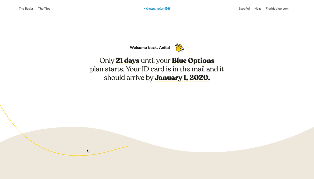
Version 2: Now we’re talking!
After another week of both design and development iteration, we felt much more confident in the new design. It was a time consuming, but necessary endeavor. The flows made more sense, the pages weren’t jarringly snapping to the viewport, and the typography/color palette was on lock. Simple animations are prioritized over page-snapping, letting every element gently float in. The flow makes sense across all viewports, and special considerations were made to make this microsite comply with A11Y accessibility standards.
Collaborators: XY Feng, Eva Peng, Wipawe Sirikolkarn, Sonia Boller, Chino Kim, John Leonard